Consider your favorite web pages for a moment. What is it about them that appeals to you? Why do you keep going back?
The user experience of the website holds the key. This refers to techniques, designs, and features that make navigating a website simple for visitors.
Any product or service’s growth and success are dependent on providing an exceptional user experience. Websites are the same way. Websites have evolved into an essential aspect of businesses as time has passed. Having a solid online presence is just as crucial as having a clean storefront these days. In other words, your website is a 24/7 salesperson who can be one of your most significant marketing assets.
However, when digital trends change, your website may become outdated. In some cases, redesigning may be the proper thing to do, but you may not have the time or resources to do so. Review a list of basic ways for improving the user experience on a website using the best user experience examples to assist you in overcoming this problem. UI and UX Design Services companies in Kolkata can also help you.
What is User Experience?
“User experience (UX)” is defined as “having a thorough grasp of users, what they require, what they value, their abilities, and their constraints,” according to usability.gov. It also considers the project management team’s corporate goals and objectives.”
In other words, it is all about making the visitors’ experience as meaningful and beneficial as possible.
Using white space to increase user attention
The blank space on a page is referred to as whitespace or negative space. In terms of website design refers to the space between columns, graphics, photos, margins, text, and other elements. Do not be fooled by the name; it does not mean it has to be white because it is called white space. It only needs to be devoid of any substances.
White space smooths things out and gives your website an elegant appearance. It is usually used to send a clear and direct message. Furthermore, because it is used to organize text and elements, it is associated with sophistication. It also aids in directing users’ attention to the most critical data and features.
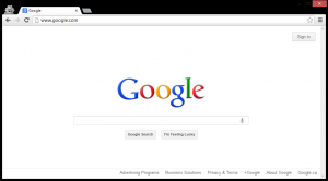
The Google search page is one of the most well-known user experience examples. It is neat, and it only allows you to concentrate on the most critical aspects of your life.
UX Design is something you should know about
The best techniques for improving the user experience are known as user experience design (UX Design). The emphasis is on simplicity. The most excellent websites make using their features simple. It is simple to look up a query on the most significant search engines. Adding movies to your Netflix queue is simple. The Hustle’s newsletter can be easily subscribed to.
You can see what I am getting at. UX design is concerned with the user’s experience on a website. Aesthetics and multimedia are not crucial in UX design. The average website visitor can be overwhelmed by this. Your main priority should be to keep things simple. Top UI design companies are always the best option to keep you updated.
Boost Page Loading Time
People do not have the time or patience to wait on the screen if your internet page takes minutes to load when everything is moving so quickly. The longer it takes, the more people will abandon the site.
According to research, the bounce rate of visitors might grow by up to 20% for every second that passes. What options do you have? If you are not already aware, Google provides a free tool to assess the speed of your website. Enter your website’s URL to receive a comprehensive speed analysis for mobile and desktop versions. As a result, you can make your web page load faster. These free, open-source server modules are also available for download.
Compressing all your photos before submitting them to your website is one of the top website user experience techniques. Your website’s loading speed will be improved.
User also read: Top 6 HTML Tags You Need to Know for SEO
Aesthetics in Web Development
Let us look at how web design can help you improve your UX. As previously mentioned, you want to design an aesthetic with your users in mind. It is not your graphic designer’s responsibility to please users; it is yours!
As a result, keep your website’s theme to just a few colours. For different sorts of text, the fonts should be consistent. For headlines, body text, and smaller text, you can use one typeface (such as in your footer). When creating a landing page, you can use one theme colour and up to two typefaces. Landing pages are an excellent substitute for a lengthy website.
Complex websites are more difficult to navigate, and these provide a better user experience. If your business does not require a complex or thorough website, these options are worth considering. It is also an innovative idea to keep your website as clean as possible. You do not have to fill any empty spaces. Some website footers, for example, consist solely of contact information and a disclaimer.
The menu does not need to be duplicated in the header or footer. However, if your website has a lot of content, this will make it easier for users to navigate through the pages. The best Web Design and Development Company will quickly help you navigate the aesthetics.
Excellent CTAs should be used
Your visitors are already aware of what information is crucial and where they should focus their attention on your page. One of those elements must be CTA’s. Your visitors will be guided and encouraged to act using a call to action button. As a result, you must distinguish them.
When developing them, you should pay greater attention to the colours you use and colour psychology. Colours, according to numerous research, influence the user’s decision. Choose the proper colour for the CTA button depending on the feeling you want to elicit and the message you want to send. You can experiment with several colours to see which one best suit your needs.
Hyperlinks should not be played with
You want visitors to click on a link you put to your page. The best method to pop it is to ignore the link’s length. People find it difficult to distinguish between conventional text and hyperlinked content because most people hyperlink only one or two words. ‘Get more information about hyperlinking’ might be used instead of ‘click here to learn more.
User also read: What Are the Link Building Strategies Trending in 2022?
Valuable information should be bulleted
Visitors will find it easier to assimilate the content when presented in bullet points. It gives people the impression that it will be easy to read, not take long, and get right to the end. Bullet points can highlight a benefit, noteworthy features, services, or accomplishments.
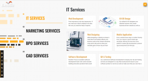
You do not have to follow the standard methods for bullet points. You may position them to represent your points with many exciting icons and vectors available.
In Short,
Your visitors must have a positive user experience. However, you do not need to spend a lot of money on a complete overhaul. These are just a few instances of website user experience best practices that will provide you with plenty of ideas for improving your website’s usability. The best IT company in Kolkata can help you with the best user experience tips and tricks.


